![CARMA Stacked Negative Logo.png]](https://help.carma.com/hs-fs/hubfs/CARMA%20Stacked%20Negative%20Logo.png?height=40&name=CARMA%20Stacked%20Negative%20Logo.png)
Whichever visualisation you choose, you can select any tag to see its co-occurrences and drill down into the coverage behind it.
Switch visualisation
- Open the Narrative Map.
- Select the visualisation control and choose the view you want.
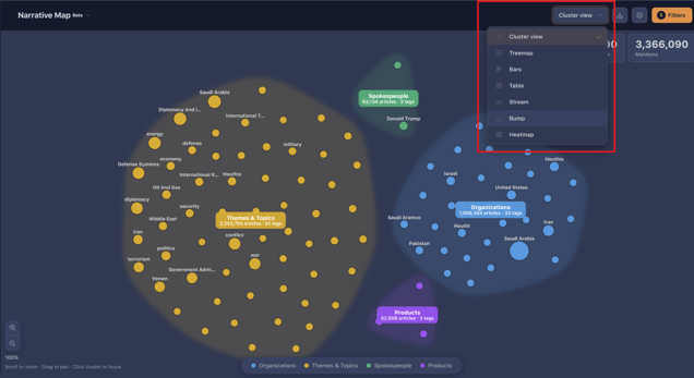
The visualisations
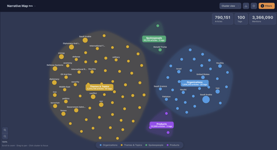
Cluster view
The default view. Tags are grouped as bubbles — best for an open-ended overview of what’s in your coverage.
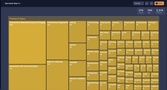
Tree map
Shows everything at once as blocks; select through to find correlations and drill into coverage, just as you would in cluster view.
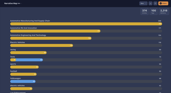
Bar
Ranks tags as bars, so you can see the top ones at a glance — for example the leading product or theme in your coverage.
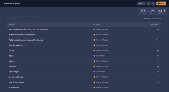
Table
The same data in a searchable table. Useful when you want to search or scan precisely rather than explore visually.
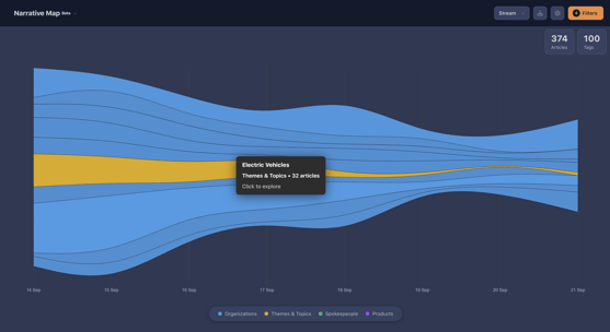
Stream graph
Shows how tags move through your coverage over time.
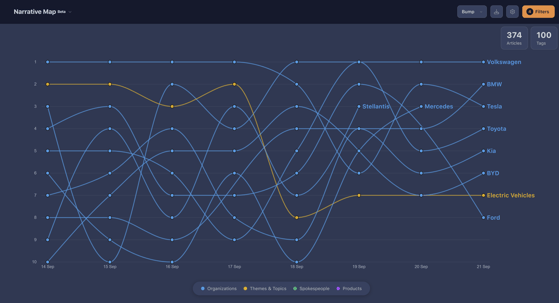
Bump chart
Ranks tags over time, so you can see how positions change across the period. Especially useful for competitors and spokespeople — see Rank spokespeople and competitors over time.
Colours and categories
In cluster view, tags appear in different colours (for example yellow, purple, blue and green). Each colour represents a category that Pipeline AI groups the content into.

Show article images
You can choose to show images from the underlying articles on the map. It doesn’t change the analysis, but it can make the view more visual when you’re presenting or exploring.
Export a visualisation
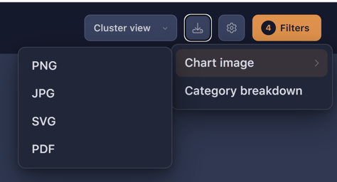
Any visualisation can be exported as an image to drop into a report or email, along with other export formats.
- Set up the view you want.
- Use the export options to export the current view.
Need more help? If a visualisation isn’t behaving as expected, contact your CARMA representative or support team, and let them know which view and filters you were using.