![CARMA Stacked Negative Logo.png]](https://help.carma.com/hs-fs/hubfs/CARMA%20Stacked%20Negative%20Logo.png?height=40&name=CARMA%20Stacked%20Negative%20Logo.png)
Note: Dashboards marked with a ribbon show analysed (coded) data only. On these dashboards the date range is the only filter that changes the data — all other filters have no effect.
Find your dashboards
1. Select the Dashboards button on the left-hand side.
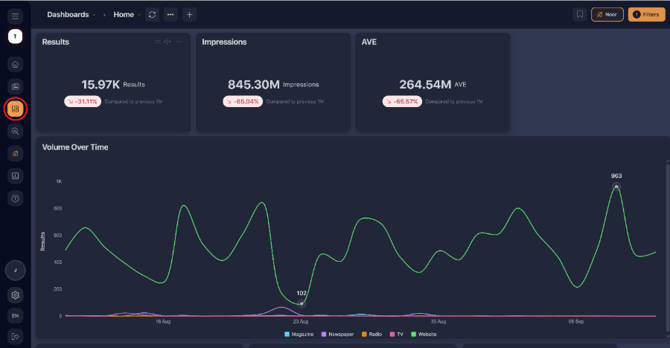
2. Select the dashboard youʼd like to view.
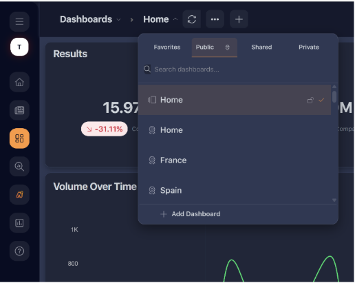
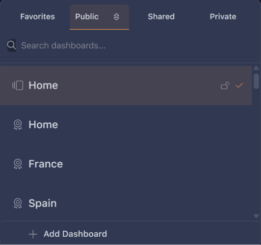
3. The dashboards that have a ribbon next to them show analysed/coded data only.
Set the date range
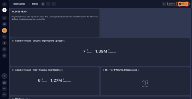
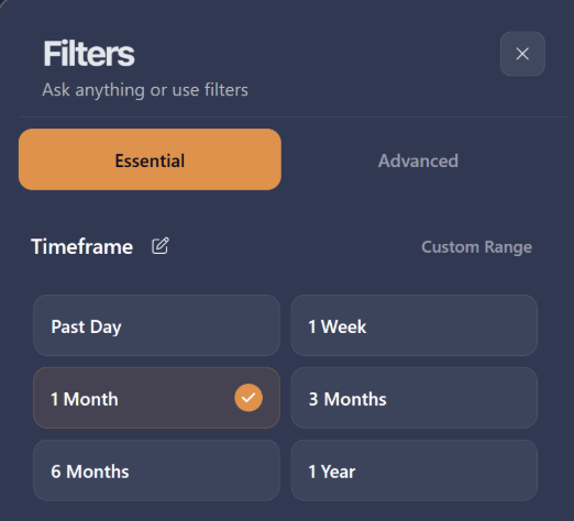
1. On an analysed dashboard, select the Filters button in the top-right
to adjust the date range.
2. Once a date range is selected, scroll through the dashboard to see
how your metrics performed over that period.
See the coverage behind a metric
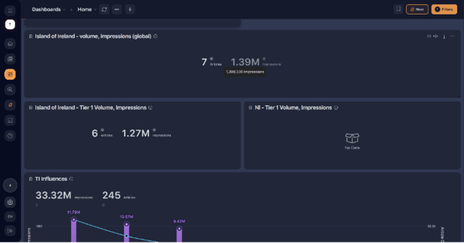
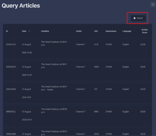
1. Select into any metric to display the list of articles behind that data.
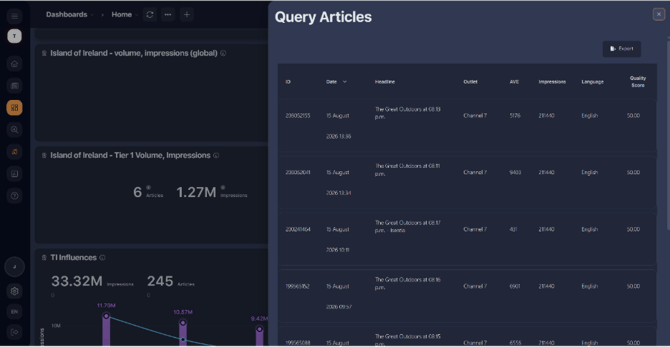
2. Export the list to Excel by selecting the Export button in the top-right corner.
Drill into charts
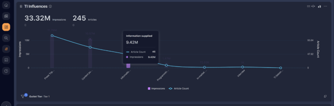
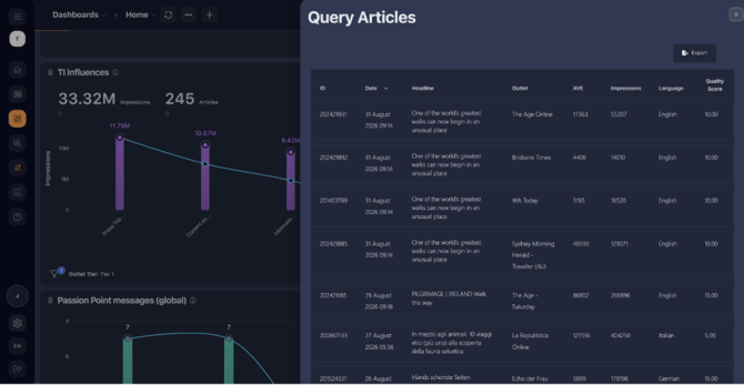
The same works for charts. For example, to see the articles behind a
single bar in a bar chart, select that bar
Export a chart for your deck
Individual charts can be exported whole to use in decks:
1. Hover over the chart you want to export and select the three dots
in the top-right of the widget.
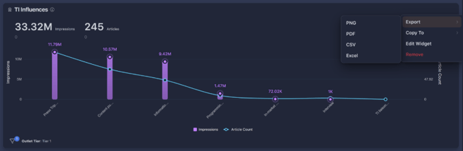
2. Select Export and choose your format. PNG and PDF export an
image of the chart, while CSV and Excel export the data behind it